Healthy Kids
The Omaha Healthy Kids Alliance brings awareness and education to families in the city about environmental hazards, green homes, and lead poisoning.

In the spring of 2016, we had a random pop-in to Round and Round from our neighbors across the street. OHKA was looking for a new website. Their current one was outdated — not responsive, hard to keep fresh, clunky, had too much info, etc. Aside from bringing them into the modern age of the Web, the new site needed to raise community awareness and clearly communicate their mission — to improve children’s health through healthy homes.
Our Vision
For the website, we went through our standard process (planning + design + development). We focused on three parts of the Healthy Kids story: what a healthy home is all about, why it matters in Omaha, and what you, as a visitor to the site, can do.
In addition to the website, we spent some time evolving the overall brand to bring more alignment with their home-specific mission. With photography and video, we provided OHKA additional assets to help support their communication efforts with various audiences. This comprehensive brand approach led to a new collection of visuals and a modern website that gave OHKA what it needed to do the job for years to come.

Site Design
In the planning phase, we had a couple different directions for the site. One being an actual house that content would be placed into. But it wasn’t flexible enough. For this organization, we trimmed down on the amount of information they had on their old site and designed for two different buckets. There’s the standard, story-centric content we honed and refined. And then there’s the things that get added over time — news, events, resources, and entirely new pages based on issues that come to light.
At the time of launch, the national discussion around lead was prominent, especially with water quality in Flint, Michigan. The topic of lead was able to be highlighted with an announcement bar at the top of the site and also added as a new page to the navigation in the footer.
For the visual design, we had a nice family of existing assets to work with. The logo design was solid as was their basic collection of icons, brand vectors, issue infographics, and photography that wasn’t the greatest, but would work just fine for our needs. We did update the color palette to give it a little more vibrancy, solidified the typography via TypeKit, and determined what new brand-centric visuals we wanted to incorporate into a very open, fluid page layout.


Site Development
The dev was done by the mighty Jake Welchert. Based on the site design mockups, he coded the HTML/CSS and utilized Craft as the CMS. (We love Craft. It really does put content first.) It allowed for a lot of flexibility when building out pages. It’s also very intuitive for clients. After a couple training sessions, OHKA was familiar enough to take the reins.
While the site looked a very specific way at launch, as the organization grows and changes, everything can be updated in Craft. With a new visual concept, the site could feel completely different in 6 months. Regardless of the visuals, the site was crafted to be light, responsive, and easy to keep fresh. Exactly what was needed.


Brand Assets
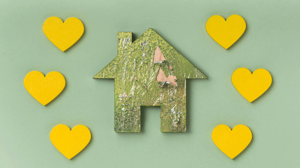
After assessing the brand in the beginning, we knew we needed a new set of visuals to make the site the best it could be. Instead of suggesting a brand redesign, we wanted to add to it and communicate healthy homes for kids in a more tactile way. What came first was the concept for a video involving a bunch of tiny houses. Inspired by OHKA stop-motion videos, like this one here, we decided to get in on the stop-motion action.
First, we had MTRL DSGN laser cut a bunch of tiny wood houses. Then we proceeded to make these tiny houses look quite distressed. To mimic the very real issues of lead paint, mold, asbestos, and so on, we worked over the houses with all manner of dirt, salt, real mold, fuzz, hammers, and whatever else we could find. When shooting the video, it’s the hands-on attention of OHKA, and a little bit of love, that turned these rough looking houses into something that’s green and safe. Then the healthy homes got handed over to the kids for a healthy future.
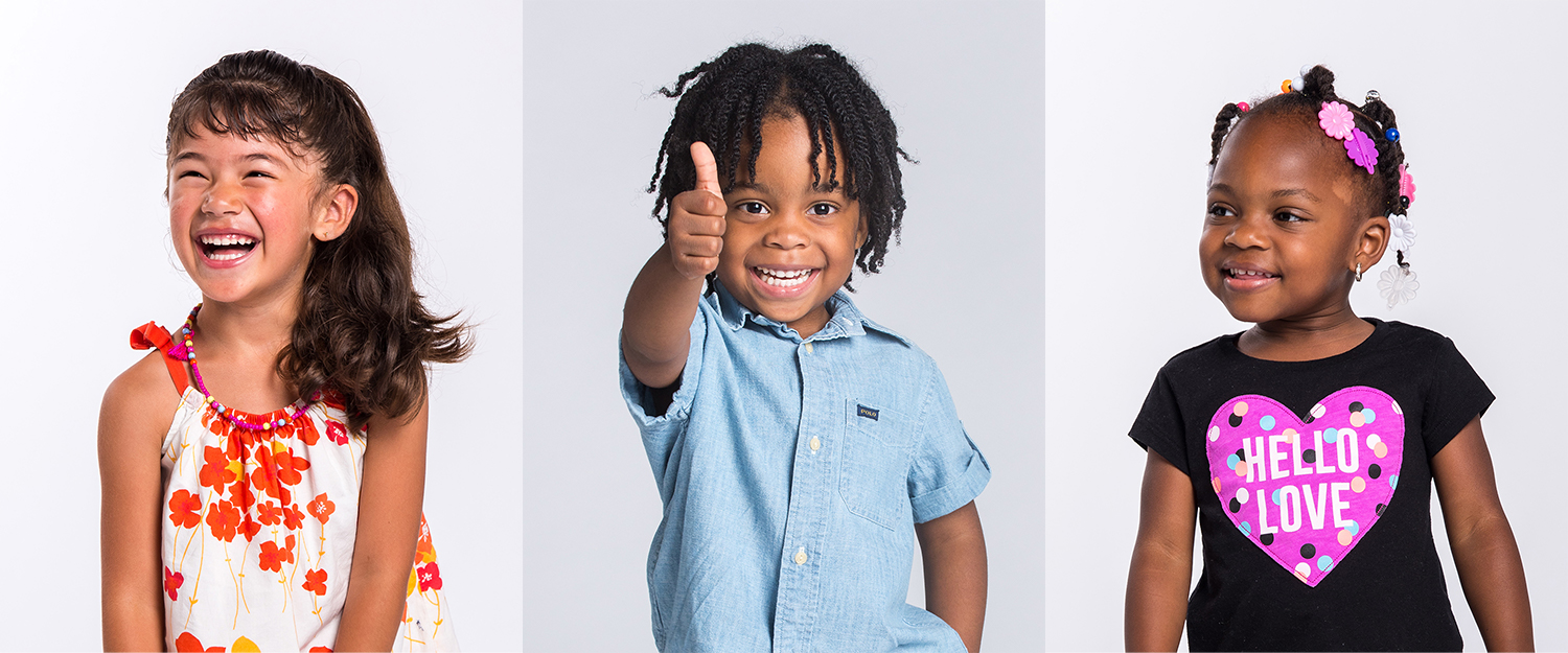
On the website, the tiny house video looped in the background. For talent, we asked families who were helped by OHKA efforts to be involved. Kids who now live in healthy homes were the small hands in the video and were also showcased on the homepage as examples of smiling, happy youth. OHKA staff also filled in when needed.
As a unifying thread weaved through the entire site, the tiny houses were then photographed to help tell more of the story. Designed to reinforce the hands-on nature of the work done day in and day out, the tiny house concept was a fun and simple way to add to a brand that already did a lot of things right. It just needed a little extra push. And a GIF.
Based on the core site content for the main 3 pages, we also created a family of 9 icons to visually reinforce messaging. Hardworking Adam Casey designed the set as well as took lead on the execution of photography and video.


NOTE: This sketch from OHKA was emailed to me towards the end of the QA process. We loved it. Thus, we cleaned it up and it became a nice little 404 page.

Random tiny shapes pattern!

We were so inspired by Omaha Healthy Kids Alliance. We generally felt like they just wanted us to do what we do to help them do what they do, which was quite motivating.
We did end up spending more time on this project than we initially anticipated, but because OHKA is such a great group of people with such an important mission, it was well worth the extra effort. It’s something we at Round and Round are incredibly proud of and is exactly the type of collaboration we look forward to doing more of.
Collaborators
Justin Kemerling: Direction + Design
Adam Casey: Photo + Video
Jake Welchert: Development
A Round and Round and Round Collaboration
2016: Creative Direction, Community, Brand, Web, Photography, Video
More Community: