Greater Omaha Young Professionals
We are next generation leaders who impact Greater Omaha’s future. Dedicated to improving our city by attracting, retaining, and engaging young professionals.
A program of the Greater Omaha Chamber, the YPs are a passionate group who serve as a catalyst to retain and attract young professionals through engagement, opportunity, and advocacy. As someone who is considered a YP himself, I was very excited to be selected to design their new website and update their overall brand presence.
As a working professional and engaged community member, it’s very important for me to feel a strong sense of belonging to a place. In my city of Omaha, I love that I do. And I’m able to work with committed individuals with different interests and expertise on a project that celebrates our city from our perspectives, as well as sets out a set of values we see as extremely important for how we grow and change over the coming years.
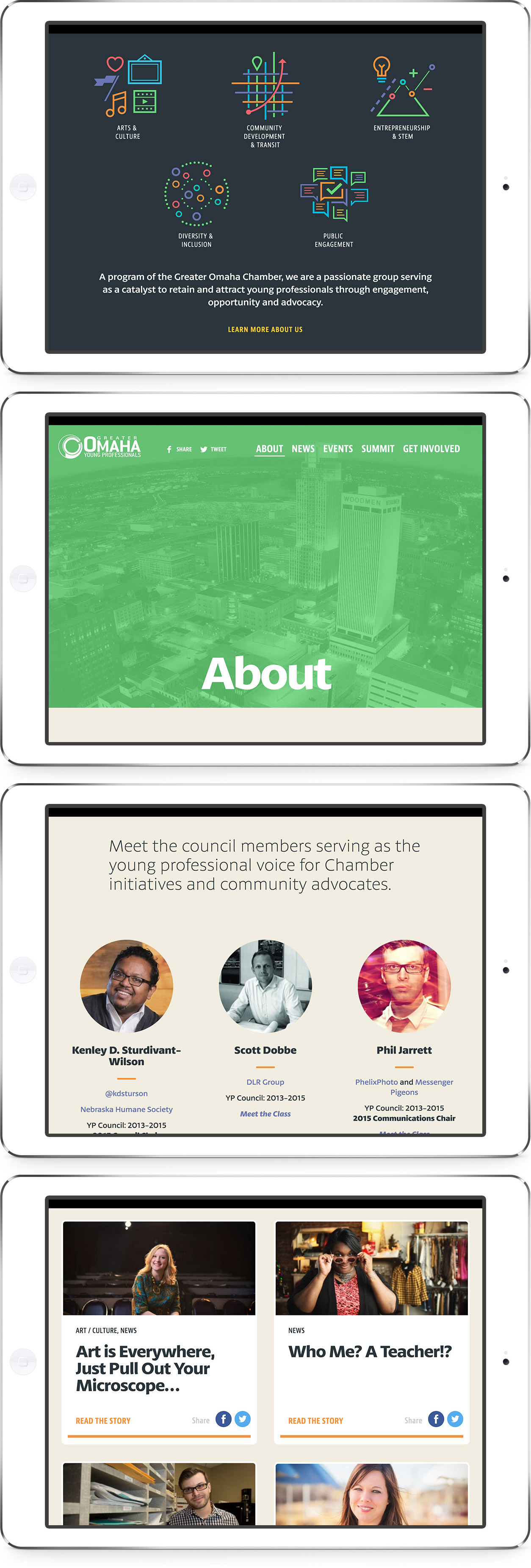
Working with a committee from the YP Council, the site needed to feel modern and fresh. It needed to represent a vibrant and diverse population. And it needed to show the ideas and impact young professionals have on our city.
The site led with direct messaging about the organization with secondary emphasis on a regular stream of content from news posts and events in the community. Events we pulled from Omahype, which is a great asset for the city all its own. A long, scrolling homepage is made of key secondary page elements.
Overall, the design is crisp and clean. A full library of event imagery became the main visual language for the design, presented in different vibrant colors for each landing page with a family of icons helping to visually tell the story of the organization’s values. The typography consists of bold headline fonts, readable serifs for posts, and condensed sans for callouts and buttons. With original content coming from YP board members in the form of “Council Corners,” the posts themselves needed to feel very inviting and optimized to be read on any device.
From a development standpoint, the site is light, fast, and responsive. And very flexible—a custom CSS and HTML with a Wordpress CMS. It’s very easy for the organization to internally add content in the form of news posts, highlighted events, updated site imagery, and the featuring of full-width stories that are extra special.
The project was a great opportunity to engage with my city doing what I do best—design. I’m very excited to see what’s next for the young professionals and how this organization makes a positive impact through its leadership.
Collaborators
Justin Kemerling: Design
Cody Peterson: Development
Jason Sawyer: Development
2015: Community, Brand, Web
More Web:


