Flagship
To launch a fleet of brand-centric websites that establish Flagship Restaurant Group as a leader in creating unique dining experiences.
When we were asked to submit a proposal by Flagship’s Director of Marketing, we were definitely excited about the challenge. Granted, restaurants aren’t something we typically design for, but as an exciting Omaha-based company with a great story to tell, we knew we could do great things for how FRG lives on the Web.
Over the last few years, our friends at Secret Penguin have created some really great brands for FRG — a landlocked seafood restaurant and a hip gathering spot for lovers of craft beer and pub food are a couple of my favorites. We took those amazing brands, and each restaurant’s physical experience, and packaged them into a modern Web presence.
We put together our vision for all their websites late last year and just recently wrapped things up with the launch of the final restaurant site. It was a huge project, which was one of the reasons we wanted to take it on. It involved photography, video, and content strategy as well as site design and responsive web development. And we needed to build the team that would get all the work done and manage everything on the creative side. The following is how it all went down.
Tripod to keep it steady. Whoa fire!
Wireless technology. Great in theory, didn’t always work though.
Our Vision
We design and develop websites to be light, responsive, and showcase brand content with an intentional experience that’s both meaningful and memorable. For any FRG site (4 restaurant sites and 1 overall company site), we wanted visitors to land, smile, and say to themselves, “I want to try that.” We wanted people to see themselves being in one of the restaurants, enjoying the food, and vibing on the overall dining experience. And we wanted people to easily find the key actions to take on each site.
In the beginning, we laid out 3 approaches centered around theme design. The minimum investment needed to make the project successful could be achieved with 1 theme to serve all restaurants. Our 2nd approach had a bit more flare with more individual attention for each restaurant while the 3rd involved really getting after it with more design time to make each brand experience feel extra special. In the end, after honing in on the features and requirements, the first approach of 1 overall theme not only could do the job, it was the smartest use of a limited budget.
Driving the project was the opening of a new restaurant outside of Dallas, TX. The timeline for the first site launch was aggressive. To get it done, the team would have to be stellar. Human Shapes not only assisted in crafting the overall strategy, but when it comes to code, no one compares. What was going to make the sites great would be what went into the themes. Standing already on a solid brand foundation, we were going to up the FRG visual library with photo and video. Given the capabilities at Round & Round, we’d execute the site design with a heavy-emphasis on impeccable photography and casual video B-roll (led by Adam Casey). To make sure the sites could strategically operate with thoughtful content, Ervin & Smith (with their fabulous CMO Katie Kemerling) was brought in to create a basic content strategy for the company and their brands.
Lots of moving parts indeed. With FRG Marketing being a crucial partner on the project management side, the pieces were all in place to move quickly and smartly.
Round and Round’s own Jake Welchert on a bun. The man has vision, folks.
Site Design
With the feature set established, we started our wireframe process with mobile first. This allowed us to address how the logic would work best with various locations, in multiple cities, each with their own sets of hours and multiple menu types. The site map established a clear navigation across all sites with the homepage broken down by brand, featured content, about info, and footer. The menu, with different sub-menu pages, was created and pulled into the site from a 3rd-party service called Single Platform. Comment Card and Gift Certificate checkout process where the final big features.
The restaurant theme was designed to be a workhorse. Flagship’s 4 core restaurants would utilize it with the company site getting a slight variation of the theme. All restaurants can be accessed from the company site with FRG linked to simply in the footer.
The design itself was very concise with heavy emphasis on photography. Brand elements of color palette, iconography, and patterns all had their place to give each restaurant its own branded personality even though the structure was the same. There were several different image ratios speced and a few different layout formats that could be utilized depending on the content of a specific page — slider, image plus text, gallery, and team members. The only thing that didn’t change was the core typeface. We went with Soleil, a geometric sans, for its simplicity and clarity. It didn’t get in the way and was an effective visual link from site to site.
Site Development
via Cody Peterson of Human Shapes
The goal was to build something that could work as well for a restaurant with 1–2 locations in one city as it did for a restaurant with 5–10 locations spanning many cities. We needed it to work well both for a visitor (showing them just the right content) and for the Flagship team (managing locations, menus, news, and content for many restaurants with many locations). Here’s how we accomplished it.
Localized Content
Restaurant locations often have unique hours, news, and menus. So, we built in location detection to help ensure visitors see relevant news and menus from the nearest locations. Instead of the visitor having to poke around to find what they need, we do our best to make an informed estimate of what they are looking for and display the right stuff to them. Of course, they can always bypass our assumptions by toggling the city in case we were wrong (or they were using a proxy, out of town, etc.).
SinglePlatform Integration
Managing one menu for one location can be hard. Multiply that by 15 and you are getting closer to what the Flagship content team has to deal with on a daily basis. To help lighten their load, we built an integration that syncs their menus from SinglePlatform (a service they were already using to publish their menus to sites like Yelp). Now, whenever the Flagship team updates their menus on SinglePlatform their changes automatically sync to their websites.
CMS
As you can tell, there is a lot going on here. Because of this, we decided to move Flagship over to Craft (their previous sites utilized Wordpress). Craft gives us better control over the content management experience than Wordpress does (don’t worry, we still love you Wordpress, just not for everything) — allowing us to craft (is it a pun if it’s the exact same word? I don’t think so.) a back-end that is intuitive and flexible (sorry about all of the parentheticals).
Photography
Flagship Restaurant Group is all about creative and adventurous dining experiences. Blatt Beer & Table for craft beer and curated pub food. Blue Sushi for creative ingredients with energetic vibes. Roja Grill for Tex-Mex and margaritas. Plank Seafood Provisions for coastally-inspired oysters. In terms of the food and the atmosphere, all very different. The photography would be where all the differences would really be brought out.
Two half-day photoshoots were scheduled for each restaurant. The shot list was put together by FRG Marketing. The food would come out in steady succession over 4 hours. We had a little time for setup on each grouping of menu items (more time for overhead shots), then we’d get as many shots as we could; head on, overhead, really tight, wide enough to see atmosphere, and wide enough to see people in the background.
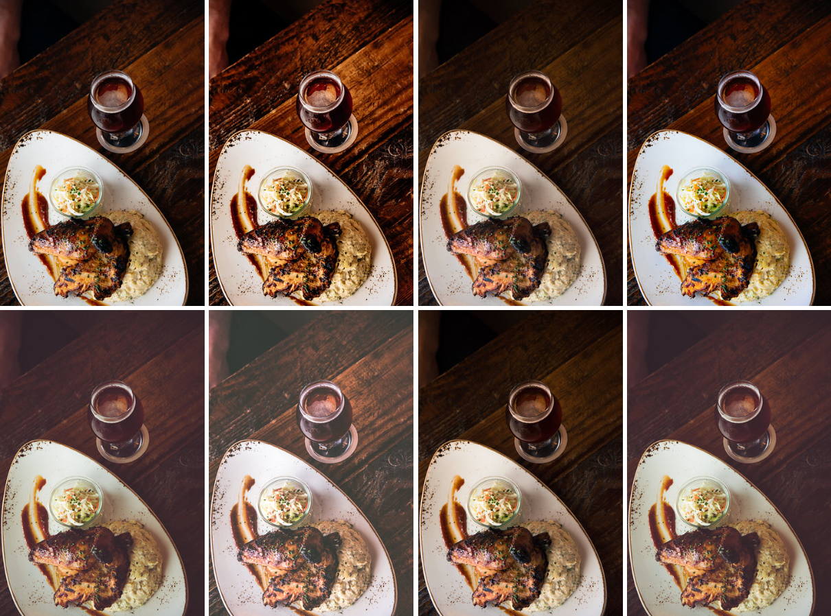
The rich textures and interesting visuals of the physical location gave each collection of photos their own vibes, depending on how the space was branded. We also put together a suite of filters to give each restaurant’s new photography an individual visual style. Standard color-correction was done to each of the final photo selections and then each image could be enhanced with the right filter to emphasize the brand on the new site or on social media.
Plank Standard Color Correction
Roja Standard Color Correction
Plank “Bright Day Vibrance” Filter
Roja “Warm Afternoon Rustic” Filter
Blatt got a bunch of moody hipster filters.
Video B-Roll
To get even more of a feel for how each restaurant feels, video B-roll was in the marquee spot of each site. 30 seconds on a loop of people, place, and plate.
For each restaurant, with a loose shot list in hand from FRG Marketing, we’d shoot video of different friends and acquaintances enjoying themselves for a night out. (Special thanks to Omaha YPs!) No professional talent here. Just the kitchen doing what they do, with food served up by a hard-working staff, casually orchestrated, and edited together to give you a taste of what you’re missing out on if you’ve never been to a FRG restaurant concept.
Each shoot was always intense. Lots of footage. Lots of ideas. Lots of back and forth, to and fro. Our rallying cry before each shoot was a loud “muthafuckin’ B-rolllllllllllll” in order to get us all pumped up for the magic to come.
The food is certainly what makes each restaurant great. But the atmosphere is what makes each of them special in their own unique ways. Thoughtful design, impeccable execution. The visual impact helps make sure that all the senses are delighted with a visit to Blatt, Blue, Roja, or Plank.
Special Note: I have cameos in both of these videos. B-Roll!
The FRG Fleet
There’s a certain effortlessness to each site. They aren’t cluttered. Everything has its place. It’s all about the food and then it’s all about the atmosphere. Just how we intended.
The Content Strategy is a comprehensive document that will make sure these sites have the activity needed to keep them top of mind. Great design, photo, video, and code isn’t anything if no ones sees it. From social media to blog content, as the strategy gets executed, the sites will continue to be a more and more important part of the Flagship business strategy.
And don’t forget to connect to any and all of these restaurants on Instagram. They’ll for sure help you remember not to skip lunch or dinner.
Blatt share graphic: 1200 x 630.
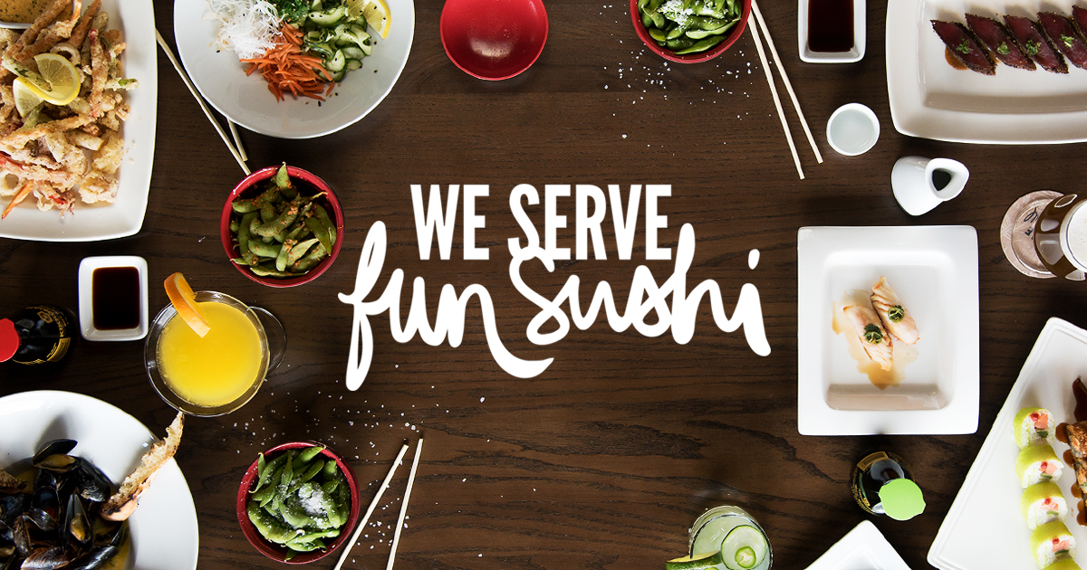
Blue share graphic: 1200 x 630.
Oyster shots anyone?
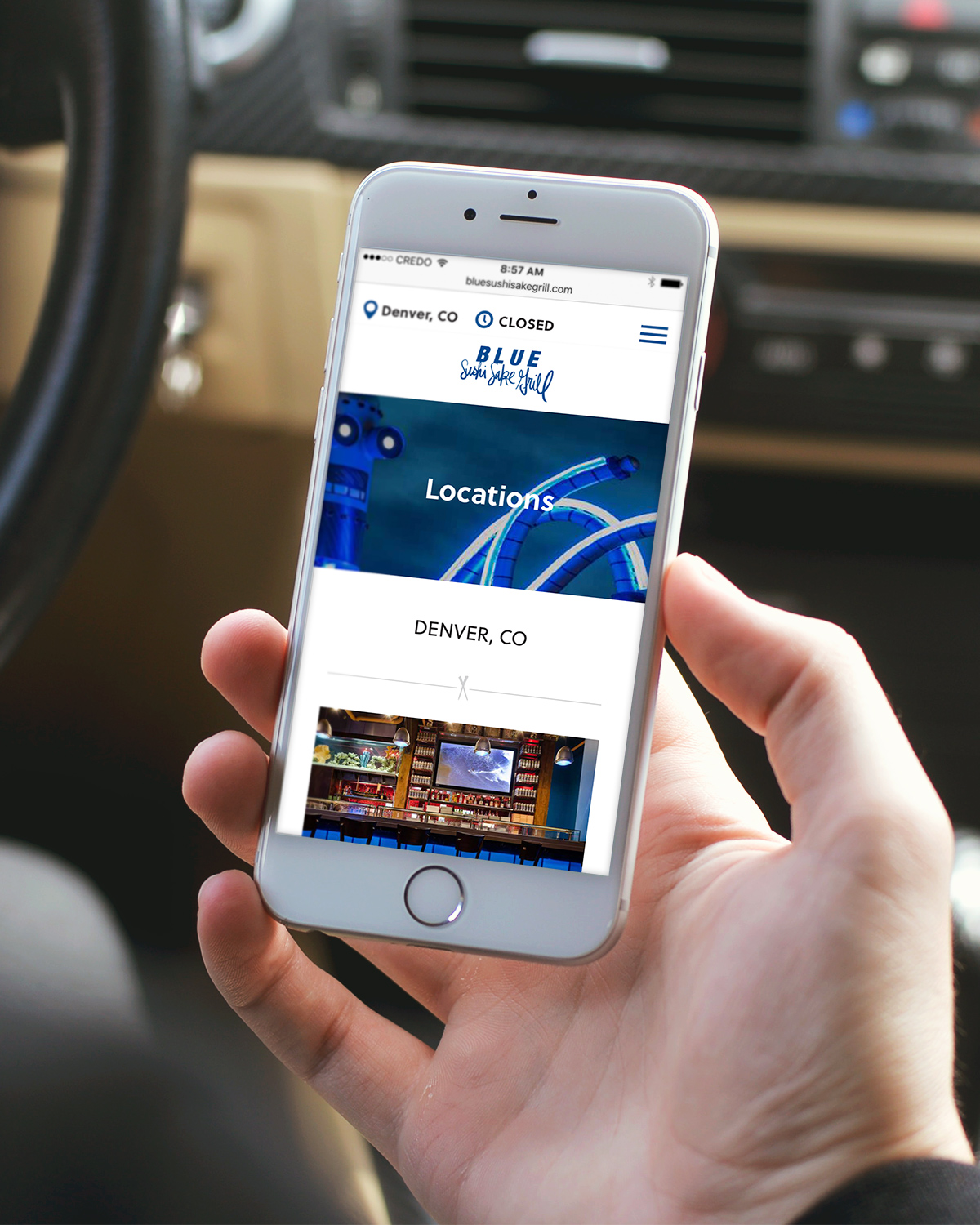
Free Invision Mockup #1: “You may be closed now, but by the time I get to Denver, we’re going to get crazy with all the sushi.”
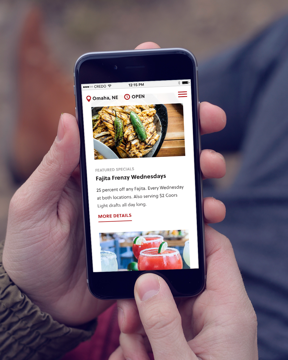
Free Invision Mockup #8: “This hipster on a bench can’t wait for Wednesday. Hashtag Frenzy. Hashtag Salt On Everything.”
Free Invision Mockup #7: “Yay sprinkles! Yay olives! But why is this phone in a pile of leaves?”
This is one of the biggest projects to date for JKDC and its trusted team of collaborators. We’re really excited about having this fleet of sites out there for these restauraturers. We look forward to bringing our style of website design and dev to more unique businesses who want to make something great together.
The Team
Round & Round: Direction + Design + Photography + Video
Human Shapes: Responsive Web Development
Ervin & Smith: Content Strategy
FRG Marketing: Project & Brand Management
2016: Creative Direction, Collaboration, Photography, Video, Web
More Web:


